Overview
Cooking App Case Study
UI/UX Design
Case Study
This is a concept case study I did alone for personal development.
This study shows my exploration an app centered around cooking & recipes over the course of a 3 week sprint. As a result of time constraint, I was forced to find ways to work more efficiently while having to manage tradeoffs within the design process at the same time.
Timeline
Winter 2026 - Over a 3 week period
Tools
Figma, Lucid, Google Docs, Framer, OBS Studio, & pen + paper
Skills
Product design, interface design, interaction design, wireframing, prototyping

Wireframe & prototype flow for the finished designs
Background
Problem & Opportunity
Create a way for users to create, discover, manage, & share new recipes all within a single app.
My key focuses during study include:
Delivering under a set time constraint
I was forced to make tradeoffs in order to meet the 3 week deadline. This included setting tight limits on scope, creating a timeline for milestones, & developing a component system to improve design speed.
Collecting proactive feedback
In order to reduce the amount of iteration or rework required, I collected feedback from users early. This input helped guide the rest of the process
Improving my design ability
Overall, my main goal was to improve my ability to make consistent, accessible designs that addressed this use case. I wanted to take learnings from my last case study and apply them directly into this process
Process
Over the 3 week period, my timeline was roughly broken down in these steps
Week 1 - Discovery & hand drawn wireframes
Week 2 - Mid-fidelity mockups & iteration
Week 3 - Final designs + prototyping
Design Process
Wireframes
Hand drawn wireframes were used to quickly experiment with different layouts & ideas in Week 1
In the first week of the case study, the wireframes were used to quickly iterate on feedback from a small user group. Some aspects of these frames can be seen in the final designs while other aspects were removed or altered.

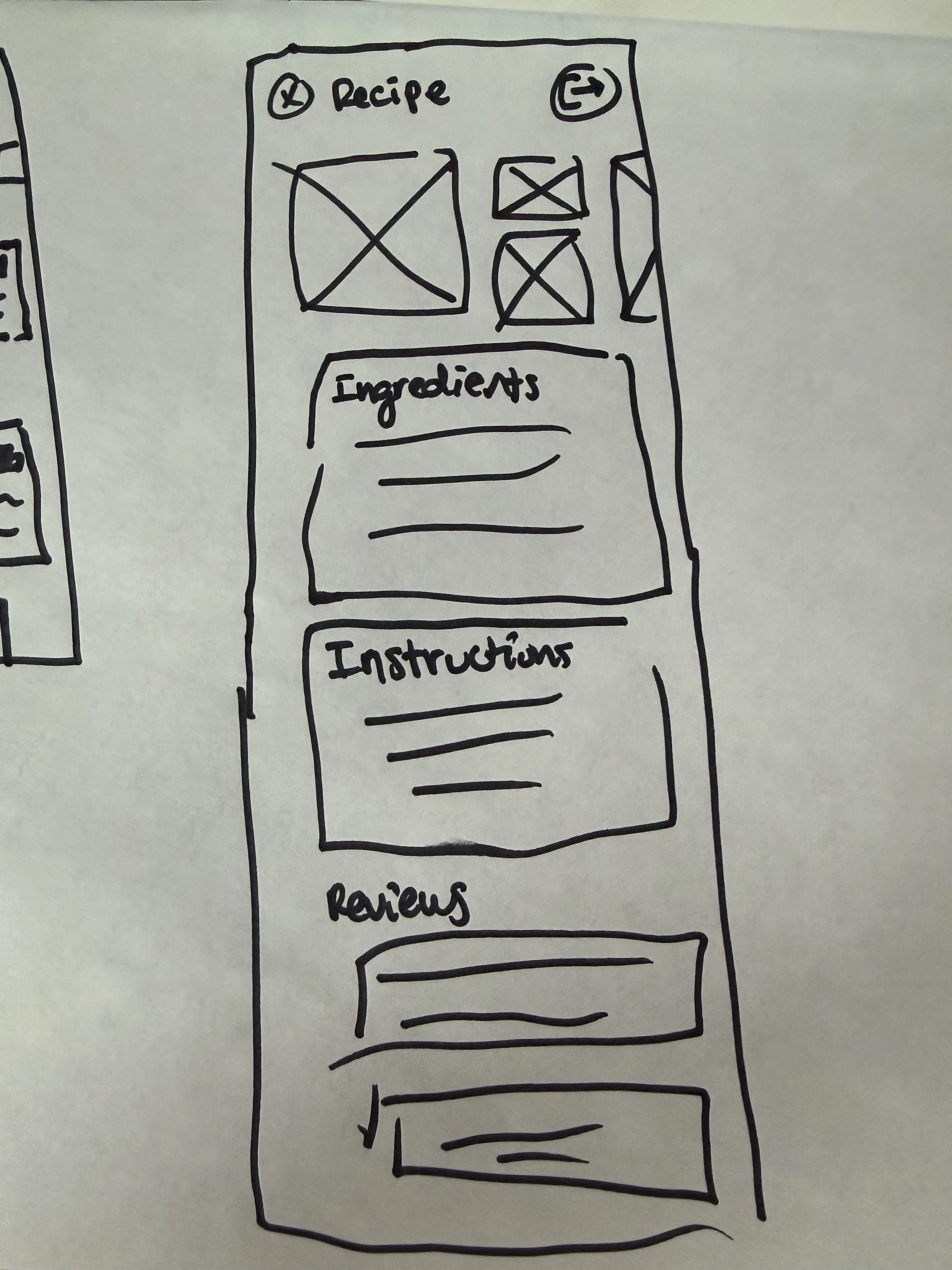
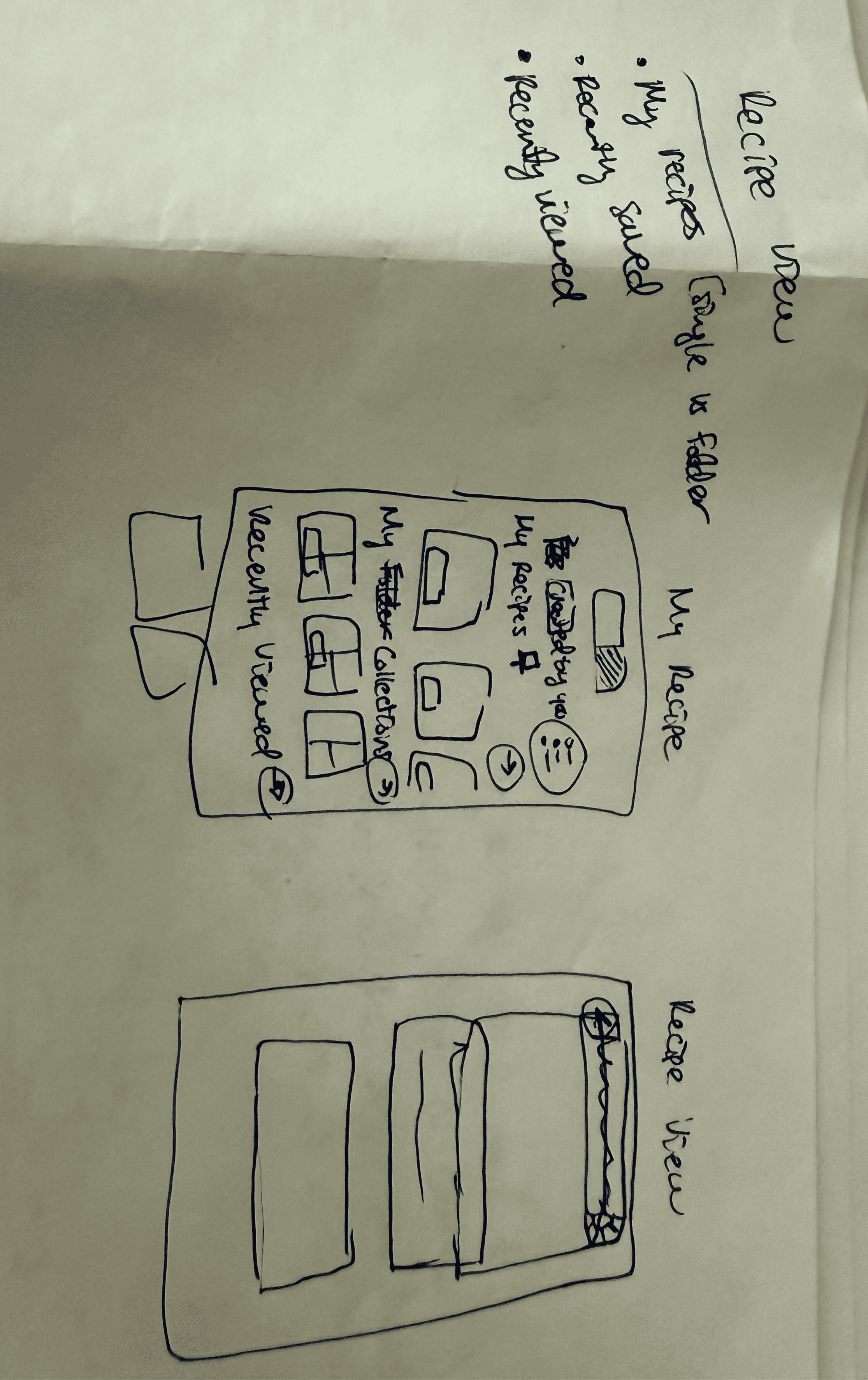
Hand drawn wireframes
Low Fidelity Designs
On Week 2, I began to translate the wireframes into Low & MId Fidelity designs within Figma.
Here I implemented the feedback on the early wireframes - specifically on information hierarchy and layout. Some experimentation still took place, however I was able to be more decisive due to iteration I had already completed.
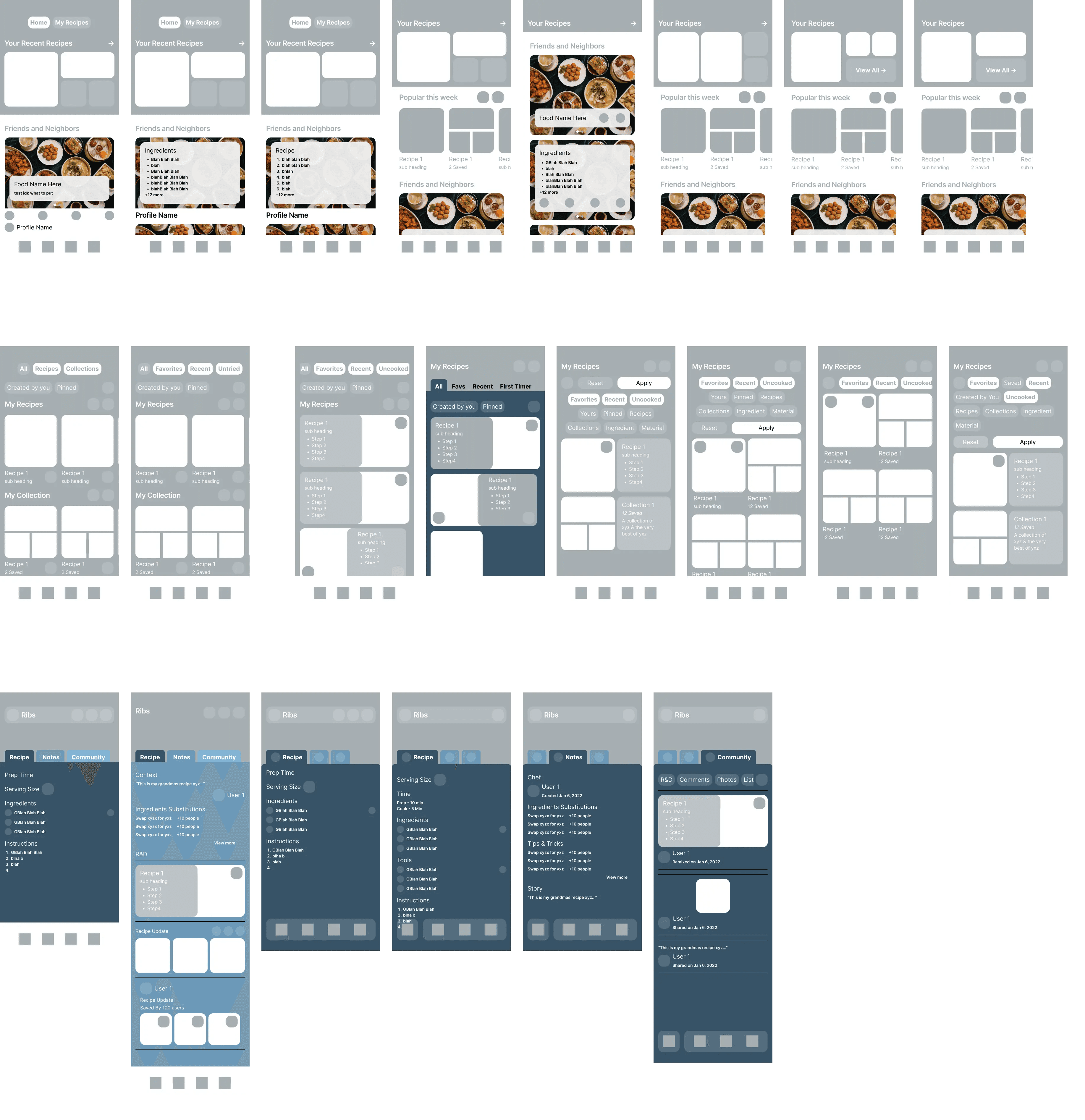
Low & mid fidelity designs via Figma
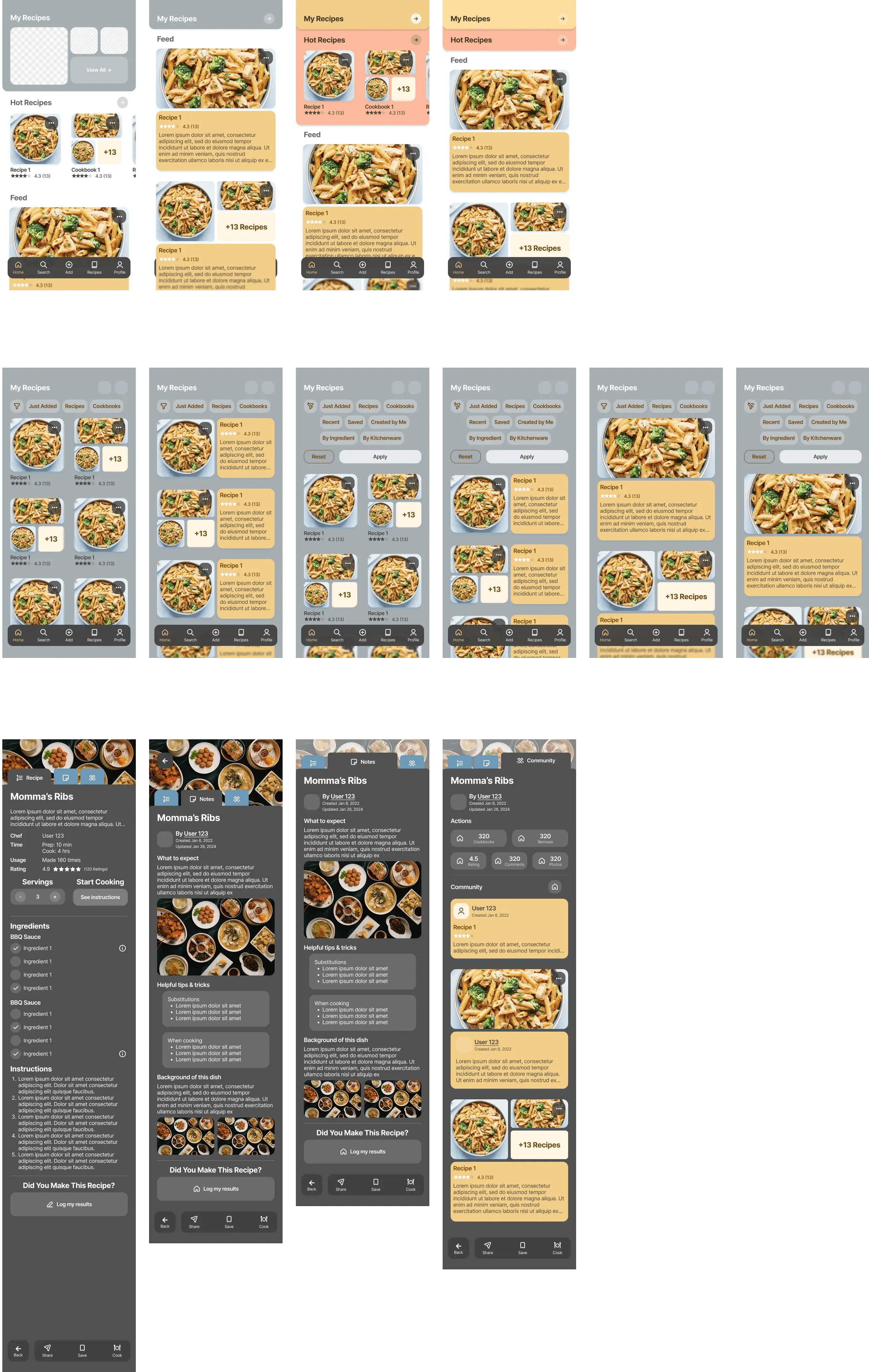
High Fidelity Designs
On Week 3, I fleshed out the final designs across the different user flows.
To ensure I stayed on track with the time constraint I initially set, I limited my scope to only include designs for the home screen, saved recipes, recipe details, cooking mode, & adding a new recipe.


High fidelity designs
Iteration
To highlight how the designs matured, the evolution of the Home screen can be seen below.
Feedback collected early during wireframing highlighted a desire for restructured homepage layout. Users wanted quicker access around a users more commonly used & popular recipes recipes but didn't find the section around their created recipes as helpful.
When the low fidelity mockups were shown, users express the desire for a dedicated space for popular recipes as well as important meta data such as rating and amount of reviews.
Wireframe, low fidelity, and high fidelity designs
Component System & Prototype Setup
To speed up the design process, global components, text styling, & colors were defined early on.
Global components were given interactions to avoid the need to recreate prototype flows later in this process. This streamlined the amount of changes required for rework into one consolidated place.
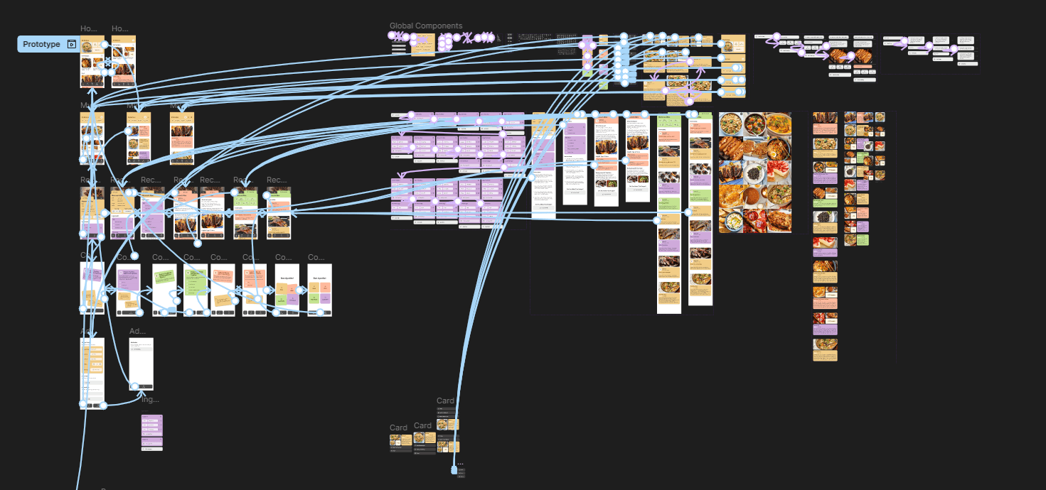
Prototype & Component System
Prototypes
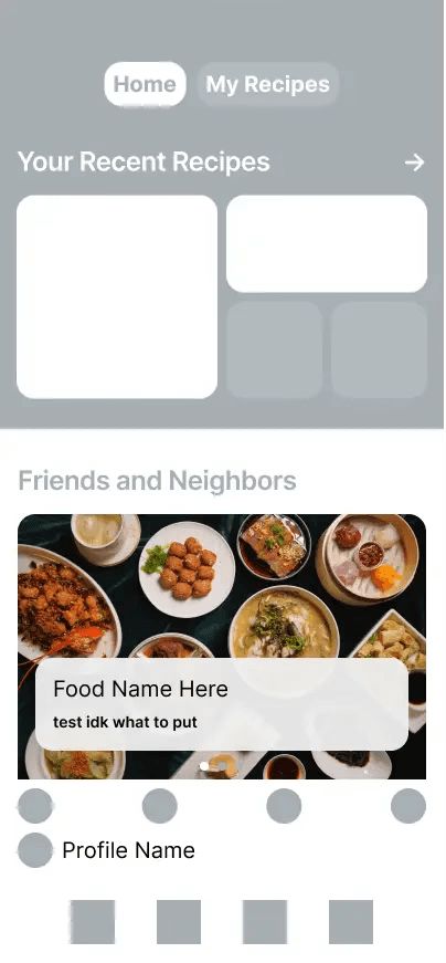
Homepage
Users can quickly see & access their recipes. By scrolling they are able to explore popular recipes and a feed from chefs & friends they follow.
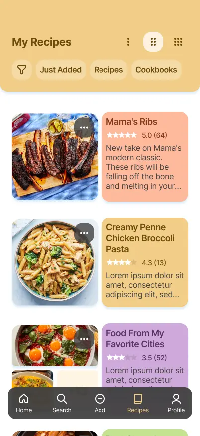
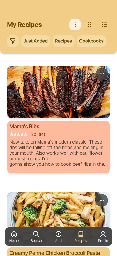
My Recipes
Here users can access a library of their saved recipes & cookbooks. They can adjust the view to get more details or a higher level view.
Recipe Details
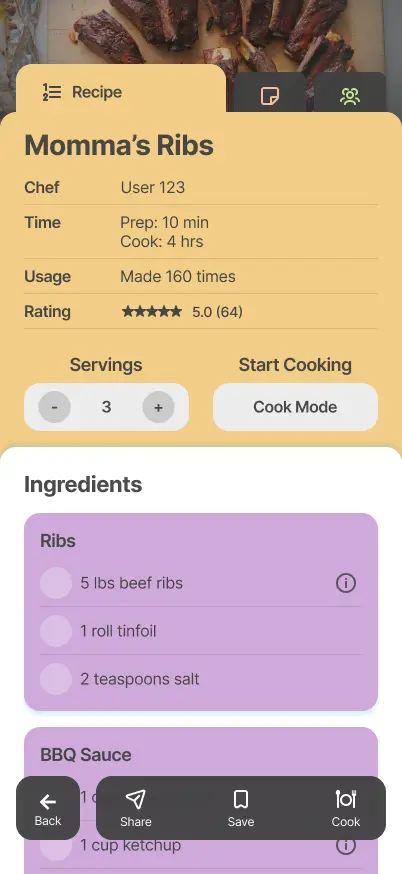
By clicking into a specific recipe, Users are initially presented with key information such as rating, serving size, ingredients , & instructions. Through the tabs, they can navigate to see some additional context from the Chef as well as community reviews.
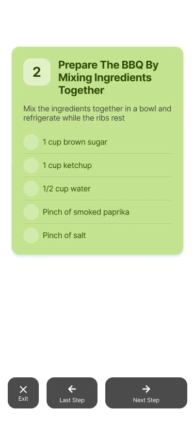
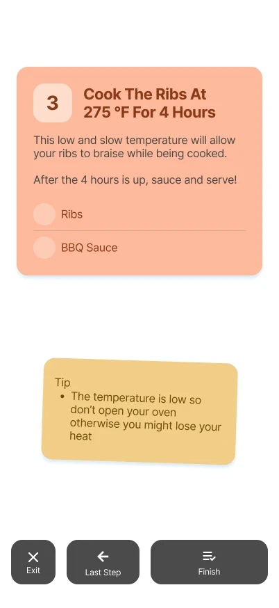
Cook Mode
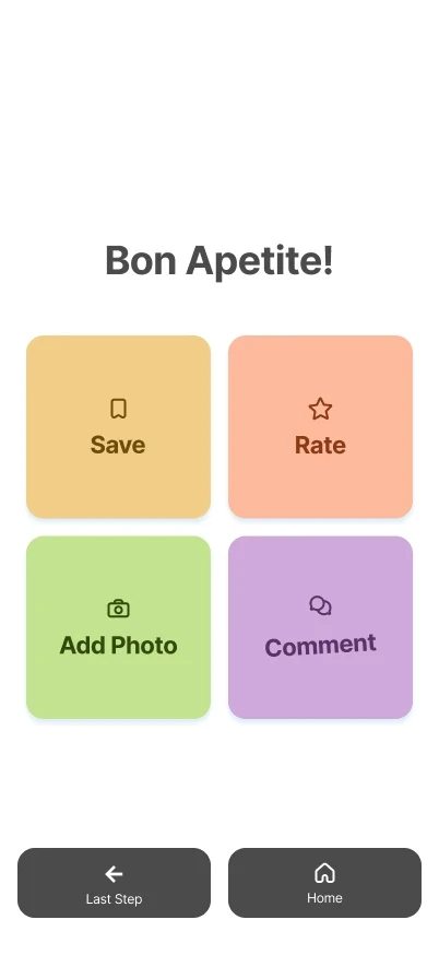
Once a user finds a recipe they like, they can use the navigation bar to enter Cook Mode. This provides a focused step by step view alongside the necessary ingredients.
Add Recipe
Users can also add their own recipes to be saved in their collection and shown on others' feeds. They provide key details like the name, ingredients, & instructions - alongside any additional context or notes.
Conclusion
Reflection
Working under a time constraint forces you to evaluate what's critical to the project.
To meet my deadline, I setup a tentative timeline & tried to narrow down on a scope. With this more defined scope, I had to sacrifice different aspects of my design thinking exploration. If I were to run a part two to this study, I would love to explore more social features with my focus group and my designs.
On the other hand, this targeted scope allowed me to have more focused explorations, designs, & results. I was forced to think ahead on how to work more efficiently while still addressing the problem statement.
There's always room for improvement.
Comparing the work (and speed) of this study versus my previous one highlights my improvement & comfortability with my thinking process & design tools. Hoping to take these learnings onto the next project I work on.
Thank you!
Thank you very much for taking the time read this study.
A lot of time and thought was put into this study. Any feedback to make it stronger would be greatly appreciated. You can reach out to me using the link in the footer below.